Ensemble Arts Philly & The Philadelphia Orchestra
Two brands, one digital ecosystem: translating Ensemble Arts Philly and The Philadelphia Orchestra into the web
A digital ecosystem that translated two established brand directions into flexible, distinct web experiences, and gave a newly merged organization a place to operationalize its combined identity online.
Ensemble Arts Philly and The Philadelphia Orchestra
In 2022, The Philadelphia Orchestra and the Kimmel Cultural Campus merged into a single organization. By 2024, the combined entity was preparing to introduce itself to the world under a new brand architecture. The Philadelphia Orchestra would retain its legacy name and brand equity, while the venue and presenting side would relaunch as Ensemble Arts Philly, a new identity replacing the Kimmel Cultural Campus name. Made was brought on to design and build two new marketing websites, ensembleartsphilly.org and philorch.org, that would launch on the same day, against an aggressive nine-month timeline, and serve as the primary digital home for both brands.
The challenges
Two brands. One organization. One digital ecosystem that needed to express each brand on its own terms while clarifying the relationship between them, and stay flexible enough for whatever came next.
Expressing the combined organization through the digital experience
The websites would be the first major touchpoint where the public saw both brands side by side and began to understand the relationship between them. The digital experience needed to do important work at scale: making the structure of the new organization legible to audiences through navigation, cross-brand wayfinding, and the moments where one brand hands a visitor off to the other.
Translating Ensemble Arts Philly’s new identity into a working website
Ensemble Arts Philly arrived with a freshly developed brand direction including wordmark, type system, and color approach. But a brand-new identity is one thing on a style guide and another thing on a live website serving real audiences. We needed to take that identity and figure out how it actually worked across hundreds of event pages spanning Broadway tours, family programming, jazz, dance, comedy, and presenting partnerships. Translating the brand from design system to working site was the real work.
Honoring The Philadelphia Orchestra’s brand equity and preparing for its evolution
The Philadelphia Orchestra is a name with more than a century of history behind it, and the existing brand carried real weight with audiences. There was no rebrand planned for the website launch, but the organization had told us one was coming, roughly a year out. That created an unusual implementation brief: build a site that fully expresses the current brand, while also being structurally ready to host a refreshed visual direction we hadn’t seen yet. The digital expression needed to be cleanly separable from the underlying templates and content architecture, so that a future rebrand could land without rebuilding the site.
Distinct expressions, one ecosystem
Each brand had its own established direction, and the websites needed to honor that. Ensemble Arts Philly is contemporary and broad-spectrum; The Philadelphia Orchestra is classical and focused. But both sites sat inside a single organization, and the digital experience needed to reflect that. Too unified, and the Orchestra would read as a sub-brand of Ensemble Arts Philly rather than a peer. Too separate, and audiences would miss the connection that was the whole point of the merger. The ecosystem needed to let each brand sound like itself while still operating as one platform.
Design and development
We built one digital ecosystem with two distinct expressions sitting on top of it: close enough to read as a family, different enough that each brand sounds like itself.
A shared structural foundation
Both sites run on the same underlying architecture, with shared page templates, the same content management system, consistent information hierarchy for dates and venues, and the same button and navigation logic. That structural foundation is what made it possible for the two brands to express themselves differently on the surface while behaving as one digital ecosystem underneath. It also gave the internal teams a single model for how content works across both sites, which mattered for the small group of staff responsible for keeping both properties moving.
Cross-brand wayfinding built into the experience
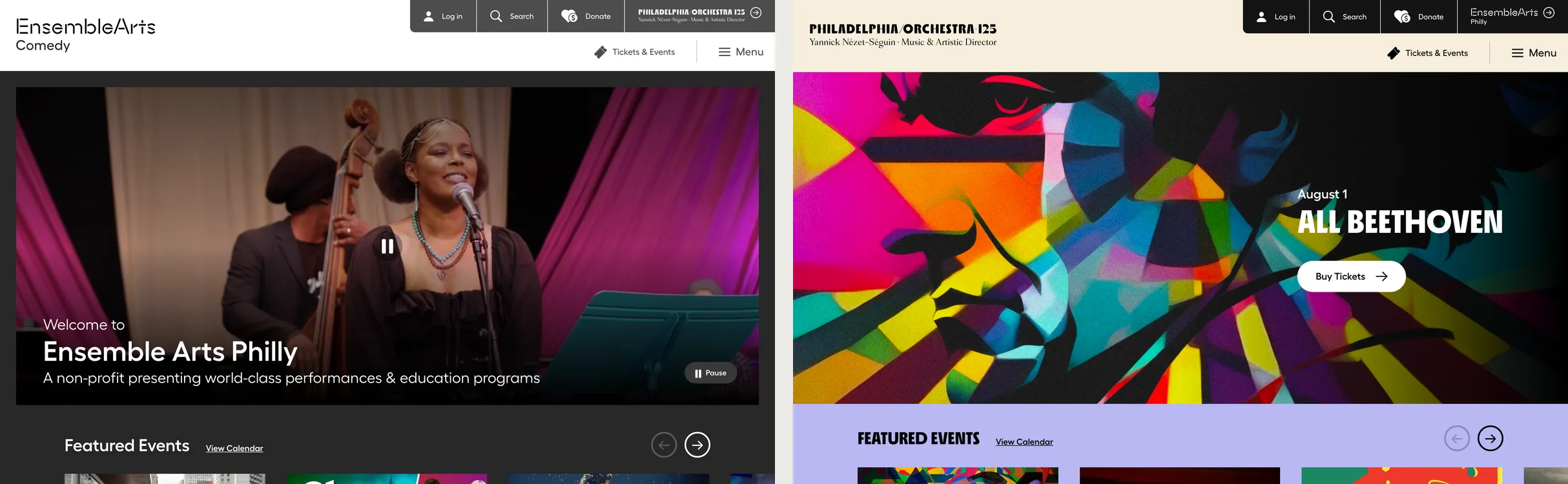
Both sites carry a persistent cross-brand link in the top right of the navigation. Ensemble Arts Philly users see a link to The Philadelphia Orchestra, and vice versa. It’s a small piece of UX, but it does a lot of work. It tells audiences that crossing between brands is normal, expected, and easy, and it operationalizes the merged organizational structure in a way that no banner or homepage announcement could sustain at scale.
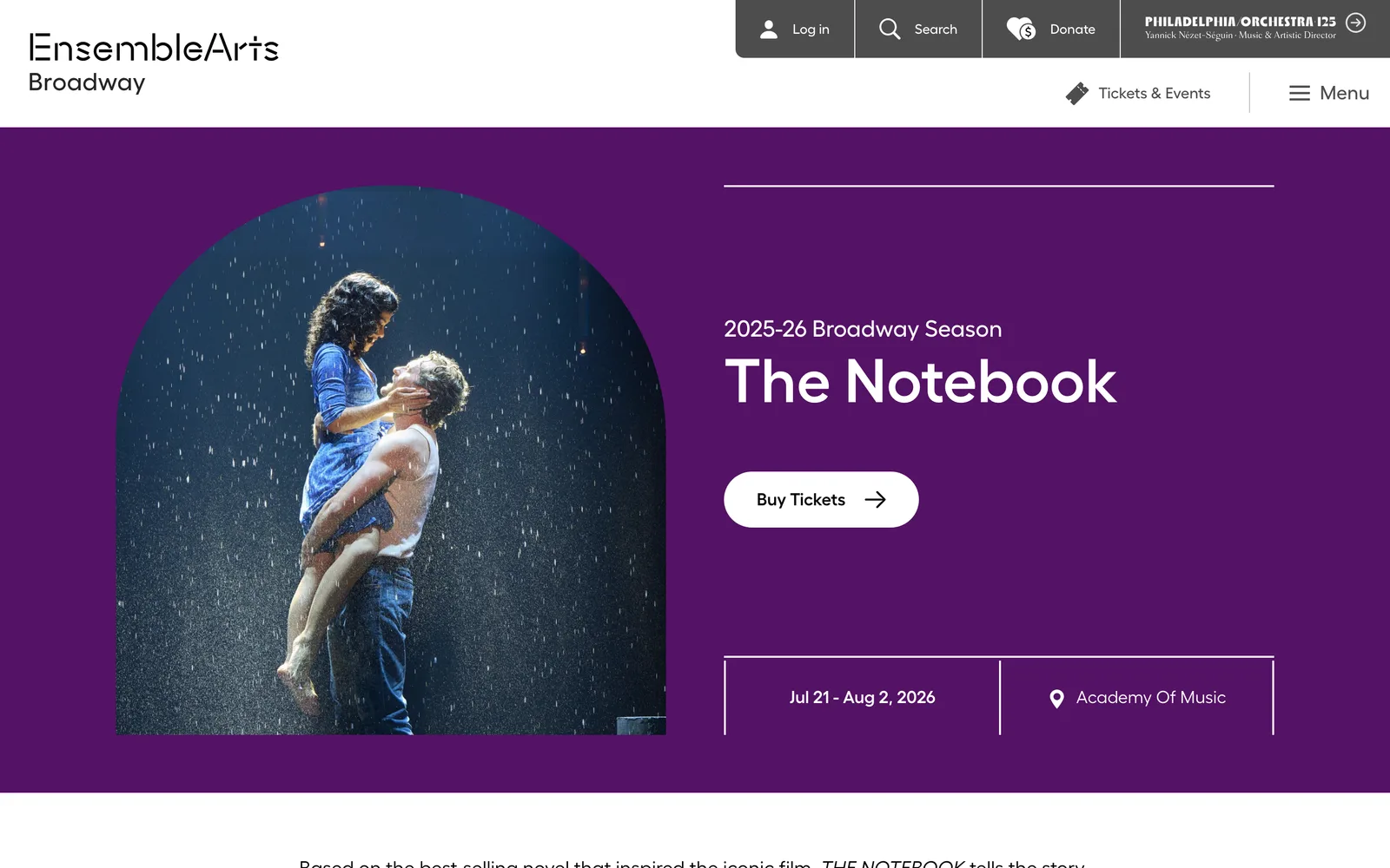
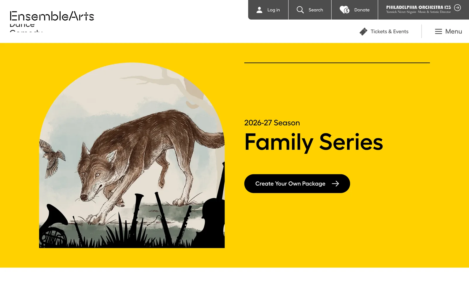
Translating the Ensemble Arts Philly identity for the web
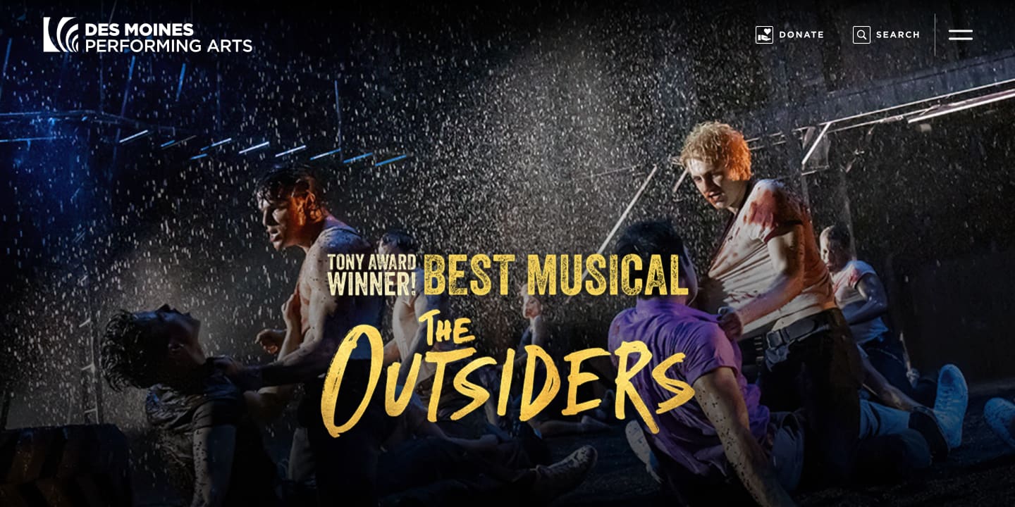
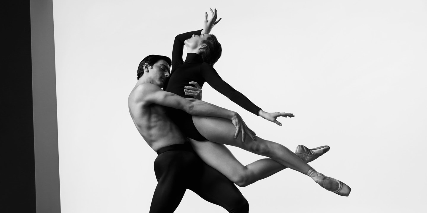
We took the Ensemble Arts Philly brand direction and worked through what it needed to do across the full range of programming the venue presents. The result is a digital expression that uses saturated, full-bleed color treatments paired with image crops and the brand’s geometric sans-serif typography. The system can shift from a children’s show to a Broadway musical to a jazz set without losing its voice. Each event gets to claim its own color and atmosphere, while the underlying visual grammar stays consistent.
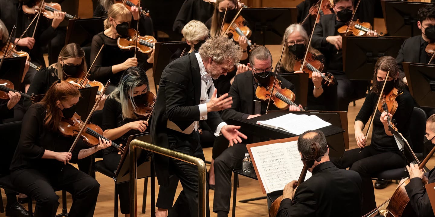
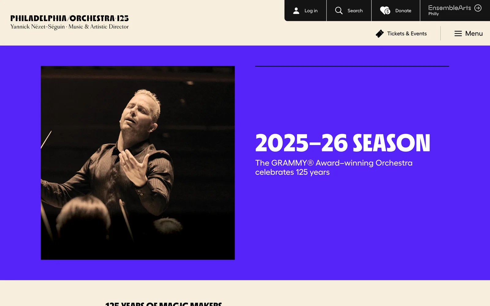
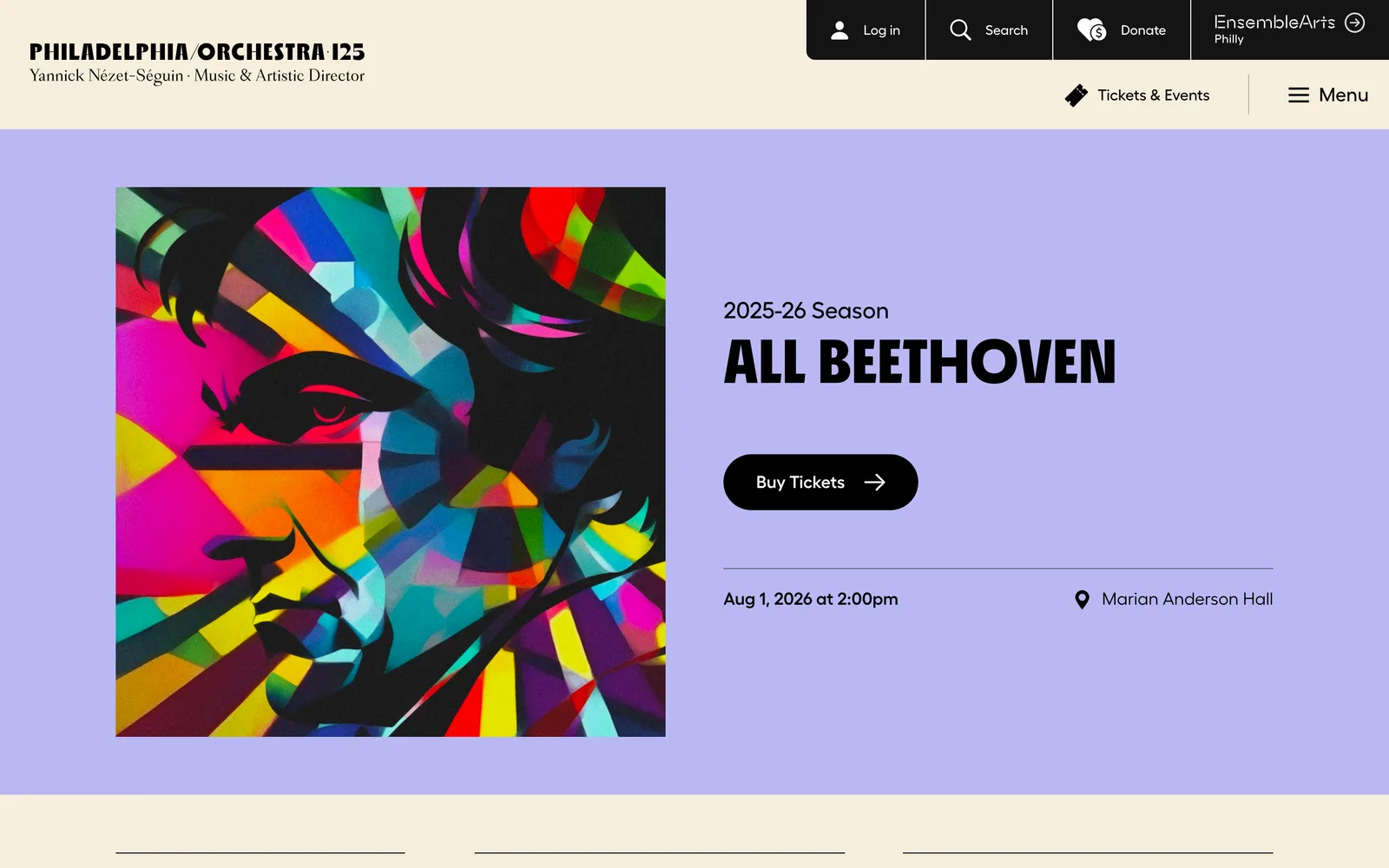
Translating The Philadelphia Orchestra identity for the web
For philorch.org, we worked from the Orchestra’s existing visual vocabulary, including the serif wordmark, restrained typography, and a warmer, more editorial palette. We translated it into a web environment that suited the gravitas of the program. Layered geometric shapes in muted oranges, blues, and yellows provide visual interest and accent without competing with the orchestral content itself. The two sites read as distinctly different brands: one contemporary and broad-spectrum, the other classical and focused. The structural skeleton underneath, including page templates, information patterns, cross-brand link, and component library, is the same.
A digital expression built to absorb a rebrand
Knowing The Philadelphia Orchestra rebrand was on the horizon, we built philorch.org so that brand expression (colors, typography, image treatments, decorative elements) could be updated independently of the templates, components, and content architecture underneath. The site’s digital structure was designed to outlive any single brand expression that sat on top of it. When the new brand arrived a year after launch, the underlying site was ready to receive it, and the organization’s investment in the website itself carried forward intact.
One ecosystem, two voices, a wide range of programming
Few performing arts organizations cover the programming range that Ensemble Arts Philly does, from touring Broadway one week to family programming the next to jazz the week after, while also being part of an organization that includes a world-class orchestra. The digital ecosystem we built had to absorb all of that without looking generic in any one context. We solved it by putting the system’s strength in its bones (typography, structure, component behavior) and letting color, imagery, and content do the work of distinguishing one brand, one show, or one programming stream from another.
One structural skeleton — navigation, layout, the persistent cross-brand link — carrying two distinct expressions: Ensemble Arts Philly’s saturated color fields and arched image crops, and The Philadelphia Orchestra’s serif, editorial system.