New York City Ballet
A new digital stage for one of the world’s great ballet companies
A complete redesign of nycballet.com and the David H. Koch Theater site, with a 69.5% increase in online conversion and a seamless path from discovery to ticket purchase.

New York City Ballet
New York City Ballet is one of the foremost dance companies in the world. A firm fixture in the cultural life of New York City, NYCB reaches dance lovers all over the world through its digital channels. From its home at Lincoln Center, NYCB provides a breadth of programming for both dance aficionados and newcomers to the form, and its annual Nutcracker season is a highlight of the holidays in New York City.



The challenges
Having launched in 2012, the previous NYCB site no longer met the needs of a modern audience. The website lacked smooth mobile experiences, performance was slow, and the design itself did not reflect the vibrant and energetic aesthetic of a world-leading dance company.
Event discovery
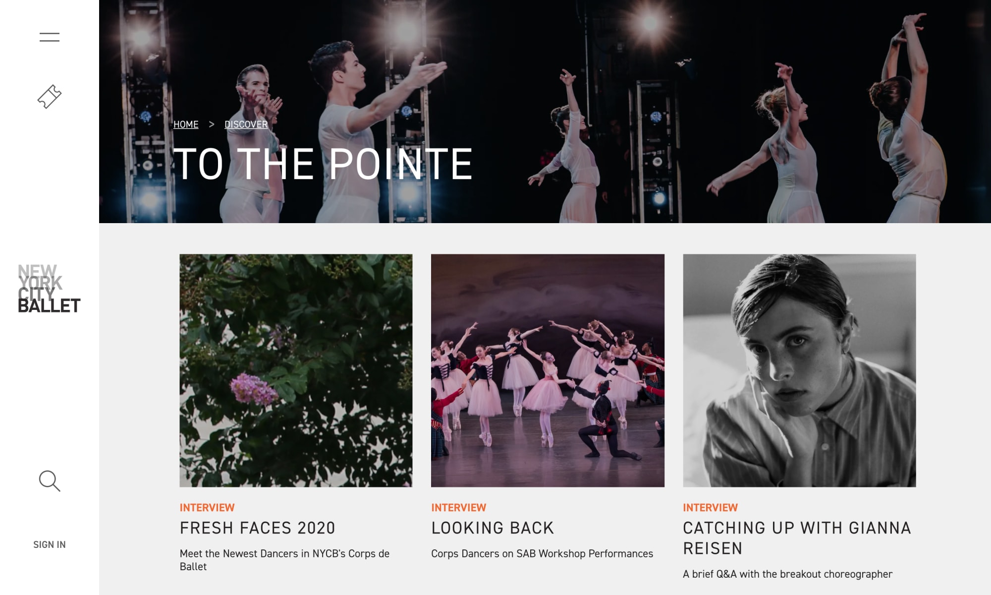
While NYCB produced and presented magnetic content, the site’s vast, unwieldy global navigation meant that casual users often abandoned the site before discovering it. NYCB required the new site to improve the presentation of their content and increase user engagement.
Unblocking innovation
In their RFP, NYCB made it clear that they wanted the website to reflect their organization’s mission to “continually innovate and… reinforce [their] position as a leading, digitally-centric performing arts company nationally and internationally.” Due to the “obsolescence” of their old site, new features were risky and costly to build, and generated limited impact. To achieve their goal, NYCB needed a partner that embraced constant evolution in the digital sphere.

What we did
Visit SiteEvent discovery
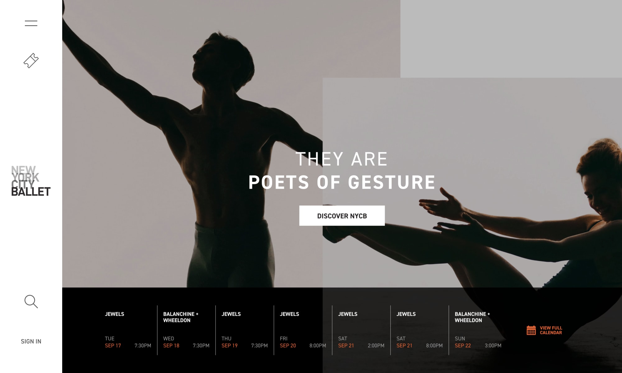
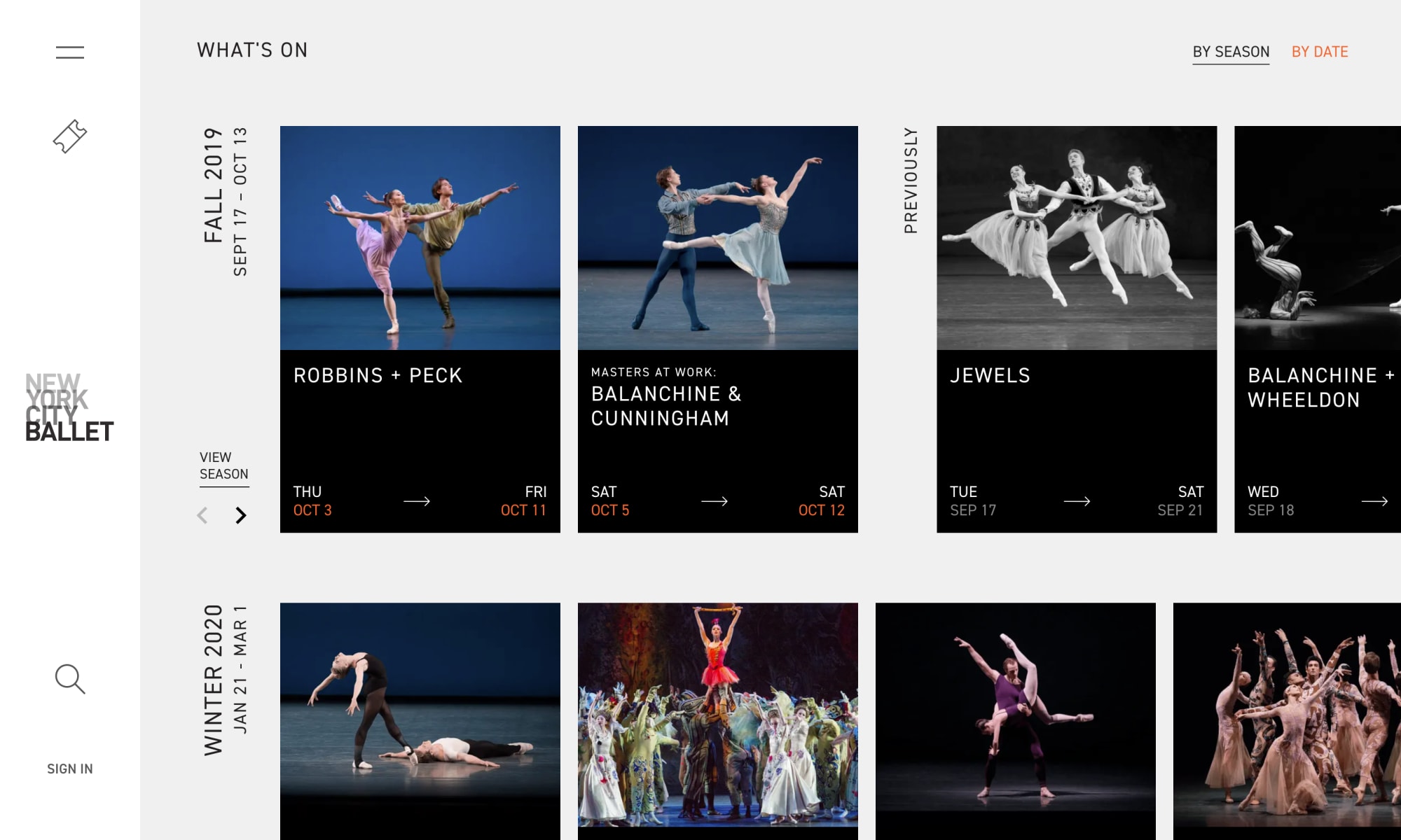
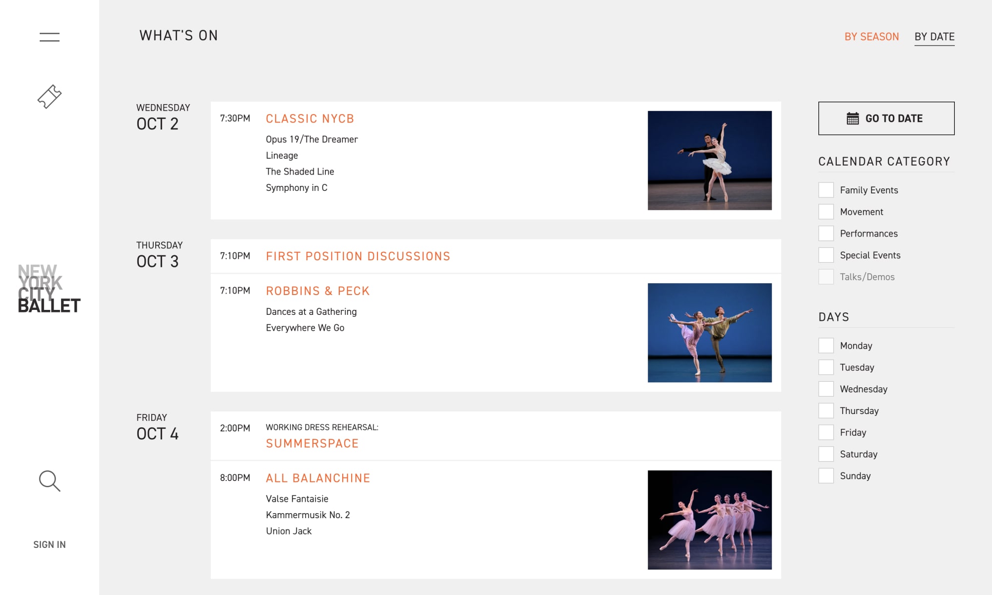
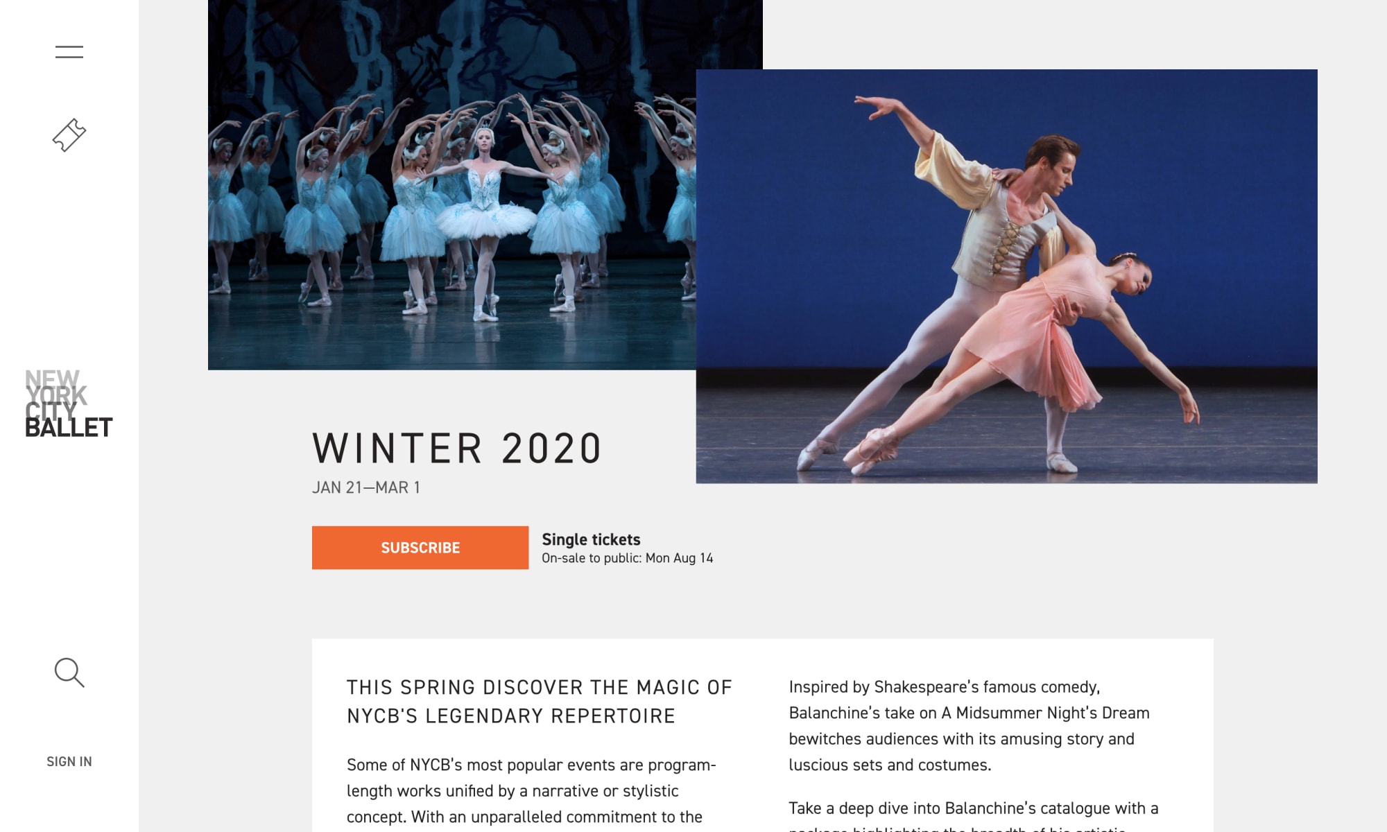
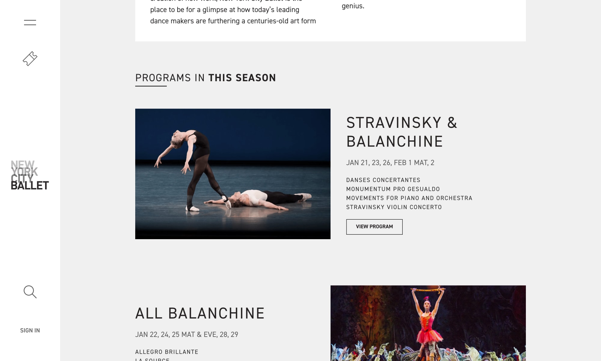
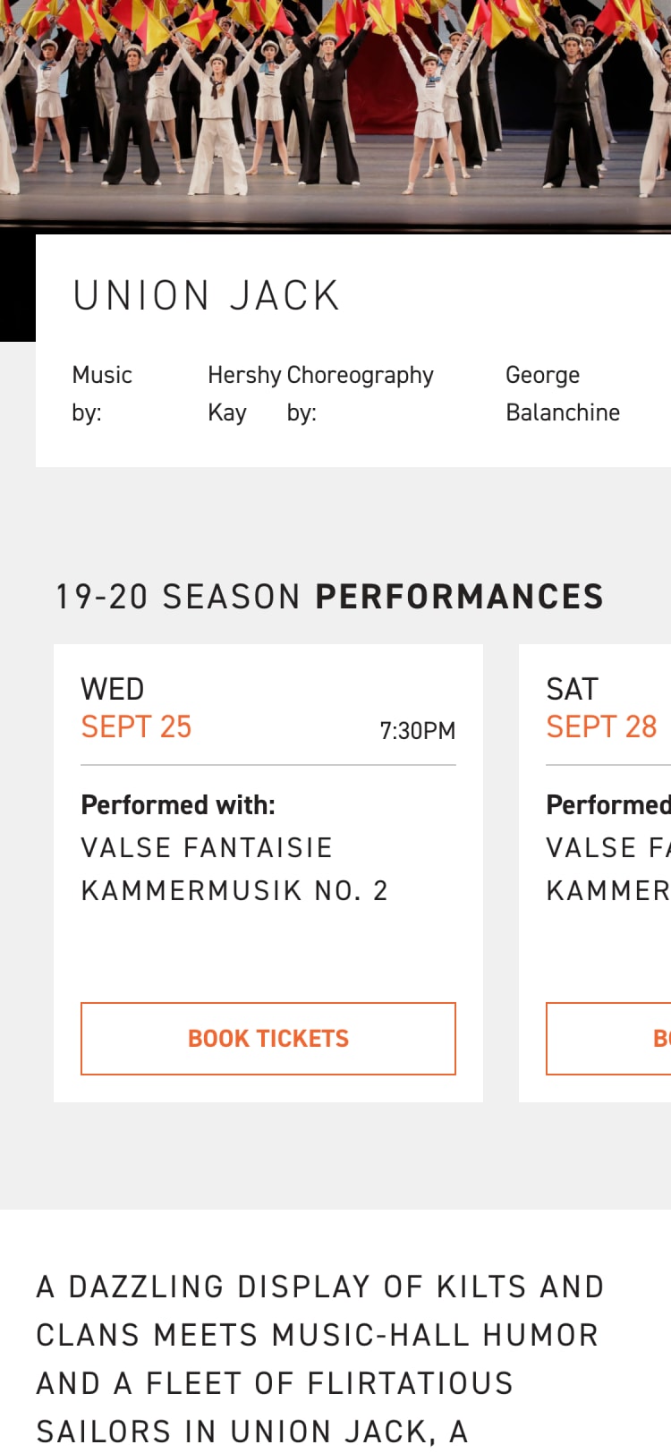
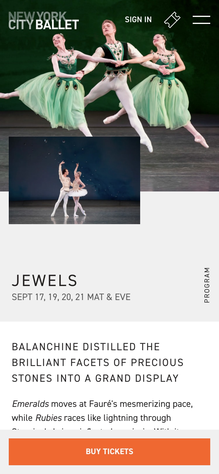
On the previous website, NYCB fell victim to two very common problems: a calendar that occupied a lot of space, but communicated very little, and unwieldy navigation. Driven by mobile-first design principles, we did away with the traditional square calendar and eliminated a significant amount of white space by only surfacing days with events in them. To make event information quickly accessible, we also implemented popovers, giving users a choice between visiting the event page or heading straight to the ticket purchase path.
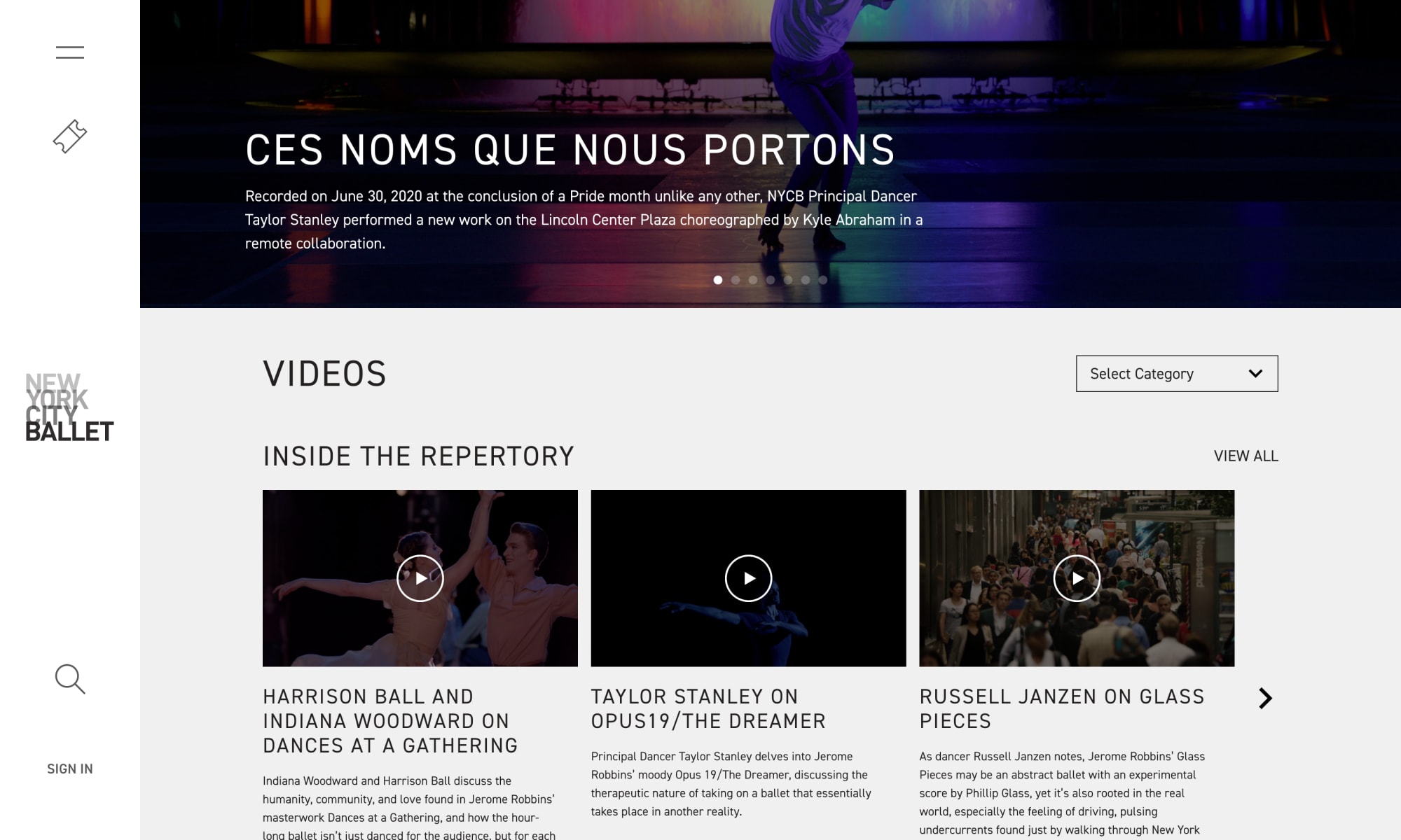
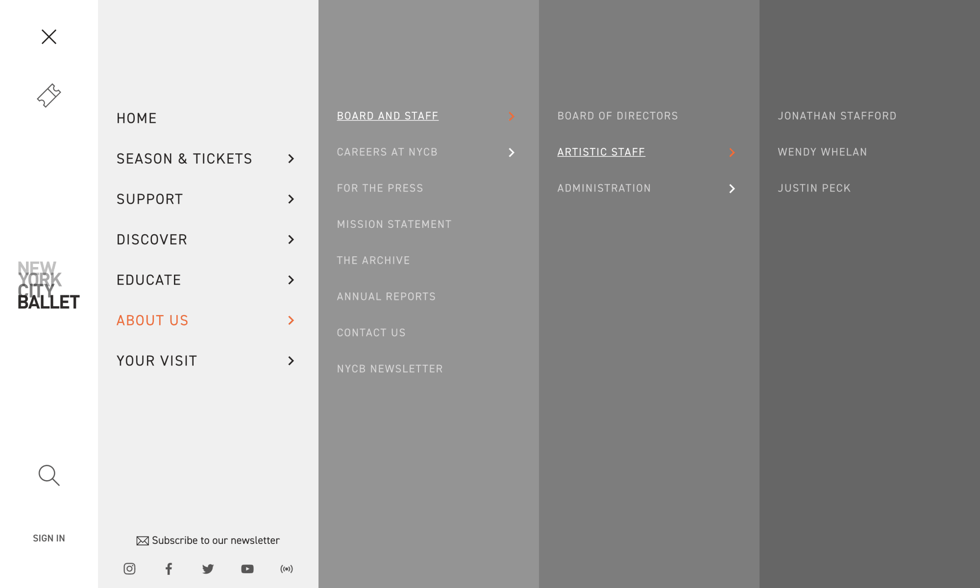
Not every interaction is transactional, though. Beyond event discovery, NYCB had received feedback about issues users experienced when trying to locate information about castings, or when searching for newsletters. To tackle this, we significantly reduced the navigation and introduced a clear structure to the site.
To make sure that the new site structure was easy to navigate, we ran user testing workshops to ensure these design choices were on track before we marched down the path to launch. The feedback revealed some minor, but important, improvements which were quickly addressed, integrated into the project plan, and included in the final product.
Setting NYCB up for the future
One of the key benefits of utilizing Made’s custom ticketing platform, BlocksOffice, is that it can be customized as a client’s needs evolve. NYCB strives for high levels of innovation, and we support this through monthly strategy meetings, during which we discuss analytics, our visions for the site, and recommendations for additional features. Combined with our regular support system, we remain constant, vigilant and active with the site. Rather than maintaining a status quo, we’re able to keep NYCB where they should be: at the forefront of digital innovation.
Pandemic
When COVID-19 upended the arts and culture industries, we were a mere three months away from debuting NYCB’s new site in time for single ticket sales. With NYCB’s priorities shifting rapidly to navigate the consequences of the pandemic, a new project plan was devised with extended testing periods and a delayed launch. We also turned our attention directly to the donation and membership paths. We had planned for single tickets to be the star of the show at launch, but with no events on sale, and a clear need for revenue, we needed these contributed revenue paths to be flawless.
