News
Redesigning National Youth Theatre
Building a digital brand by bringing physical elements to the digital sphere.
January 22, 2024

Back in August 2022, we were thrilled to kick off in-person discovery sessions with National Youth Theatre, a leading UK charity headquartered in North London in a stunning newly-remodelled (and award-winning) space on the Holloway Road.
We worked with a lot of clients virtually during lockdowns, and this was a welcome return to face-to-face meetings. At an in-person discovery, we get a special insight into what makes an organisation really tick – how the team works together and how their patrons and attendees interact in a physical space – whether that be a performing arts centre, theatre, or learning space. NYT's home is a combination of the latter two – a maze-like warren of practice rooms and communal spaces flow into a black box performance space on the first floor, with more dedicated practice and creation spaces on the second level – all imbued with the rough-and-tumble feel of being behind the scenes. This gives the feeling while in the space that you're getting an exclusive (but welcoming!) inside view into how the magic happens on stage and screen.
Overall, this project was especially exciting for the Made team – it was an opportunity to integrate with a new CRM provider (GoodCRM), which was a fun challenge for our Head of Development, Leo Thornton and his team. It was the first time Digital Producer Linda Yu worked on a new client discovery with our Head of UK/AUS Client Services, Karan Mahay. It was also a big learning experience for me, as it was my first opportunity to work with a UK-based client, especially one that specifically focused on the needs and requirements for young, digital-native artists and performers. But it was perhaps most delightful for our Head of Design, Stef Grindley, who's been with Made for nearly two decades. His wealth of experience and insights working on projects for almost all of our clients around the world afforded him the opportunity to really leverage his accumulated years of experience to help the team at National Youth Theatre think through the digital expression of their brand in a tangible way.
We asked him to reflect on the project process, now that the site has been in the wild for a few months.
There was a delicate balancing act that needed to be considered when reflecting NYT's brand values digitally. The website had to be fully accessible and inclusive, and this needed to be reflected in the simplicity and clarity of messaging and through clear, considered layouts. Yet the site also needed to be dynamic, exciting and reflect an organisation that is youthful, brave and bold.
Digitally these two things often run contrary to one another. The cutting-edge online can often be exclusive and is almost never accessible. Therefore it was a must that we ensured our choices, while bold and exciting, should always consider the site's users.
During discovery we spoke a lot about how the building has done such a great job at reflecting its relationship to NYT members, that it felt like their home. This is something that we also wanted to reflect in the website. Subtle use of textures inspired by the NYT's physical space were included in the design, but we were cognisant that this shouldn't overshadow the need for clarity and shouldn't become a gimmick.
As we worked through our design and branding conversations, it became clear that while NYT had some strong visual collateral, it had official brand guidelines, colour palette or even a secondary typeface for body copy. We quickly realised that we needed to formalise these things for digital application.
We wanted excitement to be imparted through bold use of colour; we looked at a range of colours that NYT had used for previous print work and created a palette for them consisting of dark and light versions of each colour. This would allow bold colours that would be accessible in all contexts, as backgrounds with light text, coloured text on dark backgrounds or coloured text on light backgrounds.
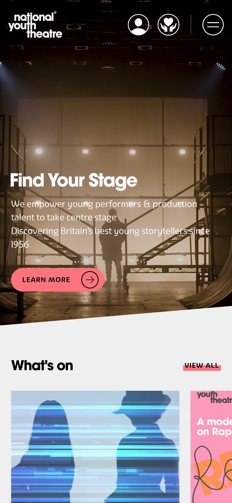
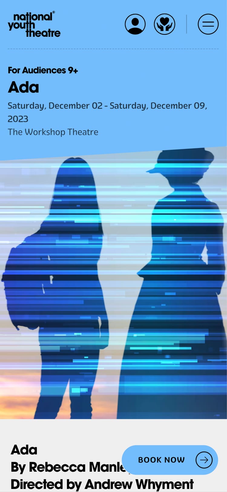
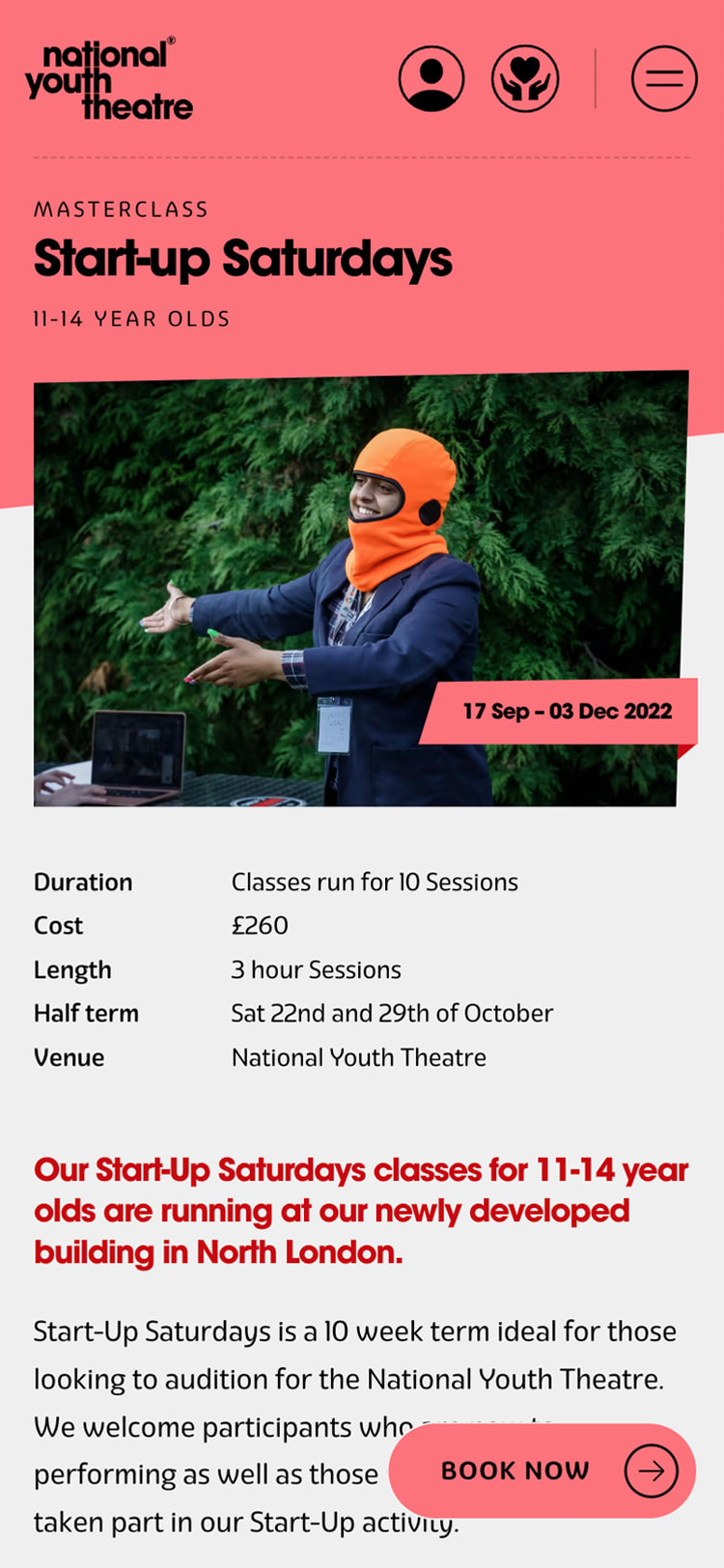
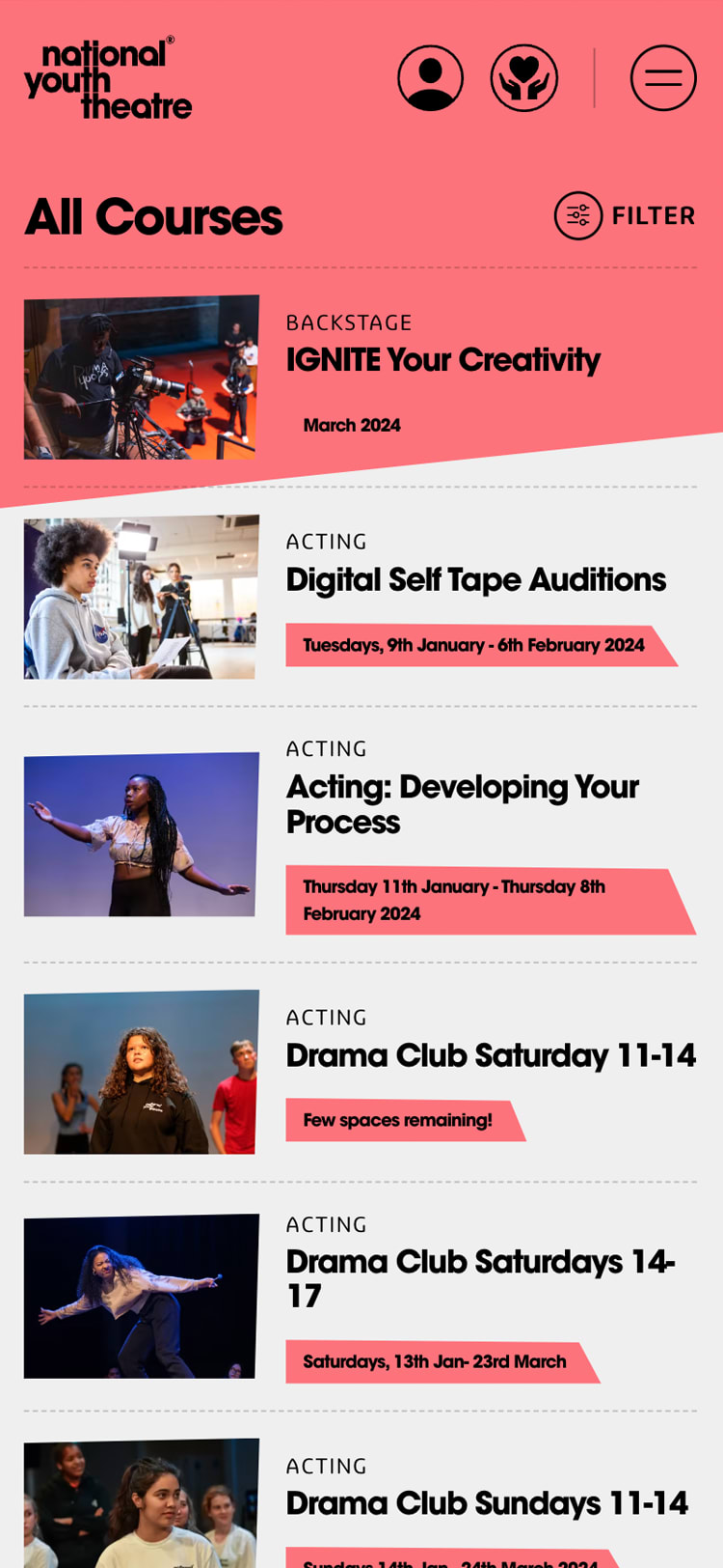

By selecting strong photography options, we looked to introduce image treatments and subtle shapes to content areas that reflected the interior of the building. The plywood facade throughout the building – while made of rectangular panels – never felt rigid, as you would always see them presented at some sort of angle. Replicating these shapes on the site lent a certain fluidity to the layouts and stopped the design from feeling boxy or stifling. Where appropriate, we could also inject movement using some of the fantastic video collateral that was available from NYT's concerted focus on helping its members develop digital content creation skills.
Finally we looked at typography. In print, NYT had been using AvantGarde for titles and body copy; in the context of a poster or brochure this could be seen as a bold choice, but it lacked the nuance and clarity required for long form content or situations that required smaller typography options. We reviewed a number of complimentary typefaces based on the requirements and eventually settled on Eigerdals. A visually warm sans-serif type family, Eigerdals struck the perfect balance between feeling fresh, modern and friendly while also being easy to read. Consisting of a variety of different weights, Eigerdals also allowed us more freedom of choice when making selections based on size or typographic hierarchy.
We couldn't be more pleased with the result of the synthesis of design, engineering and digital brand strategy for this project. Learn more about the entire project in our full case study.


Subscribe to the
newsletter
Sign up now to our utterly private, spam-free and occasionally insightful newsletter.