National Youth Theatre
Designing futures for a leading youth arts charity
An accessible, mobile-first website connecting thousands of young people to training, auditions and memberships — with full CRM integration.
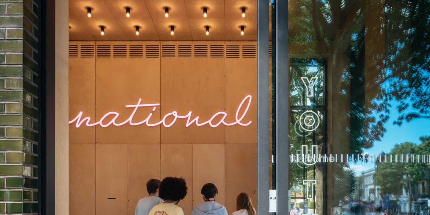
National Youth Theatre
National Youth Theatre is a youth arts charity that engages thousands of young people aged 11-30 around the UK every year.
Established in 1956 as the world’s first youth theatre, they offer young people training and opportunities in a variety of theatre related disciplines, both on the stage and behind it, and produce ambitious theatrical productions in local communities and on global stages. Their alumni include internationally recognised talent such as Helen Mirren, Daniel Craig, Chiwetel Ejiofor and Kate Winslet, amongst many, many others.
The challenge
National Youth Theatre came to us with a problem: their site was outdated and no longer fit for the needs of the organisation. It was difficult to navigate for their young, digitally native audience, and the content was hard to find. This presented problems during the annual auditions process when resources were needed to field questions from applicants.
The requirements on the website had expanded since the inception of the original site: what had once been a simple notice board now needed to fill a plethora of functions; sell tickets and courses, provide members with private opportunities, allow young people to audition, promote merchandise, solicit donations and hire out the premises. While the National Youth Theatre is primarily UK based, they also sought to reach an increasingly international audience for their online courses and masterclasses.
They were looking for a site that better reflected the prestige of the institution, while serving their young audience’s needs.
Channeling youthful passion and energy
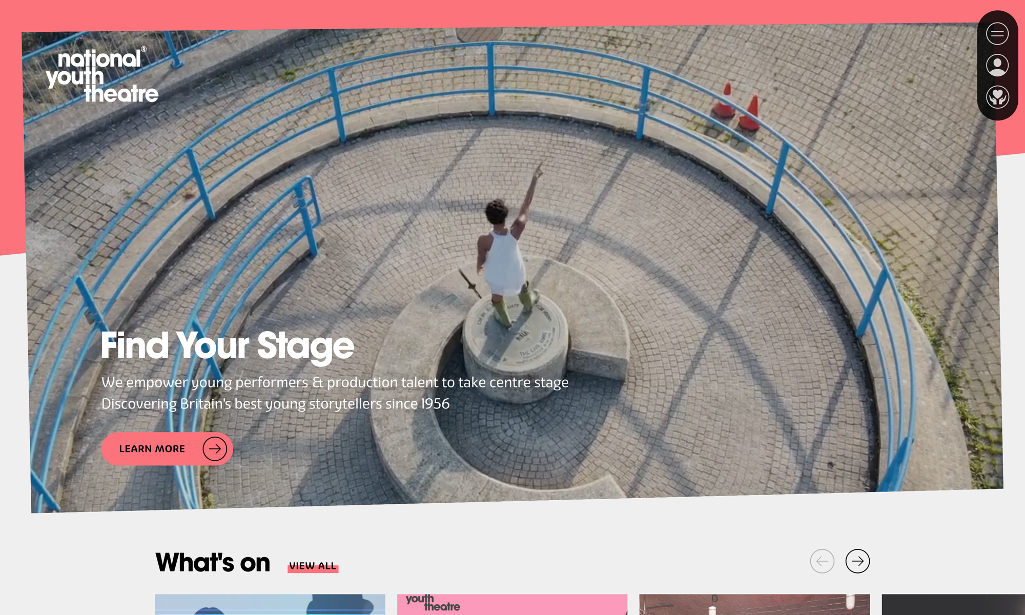
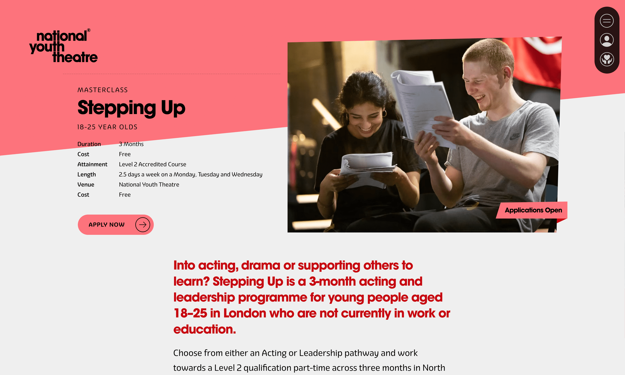
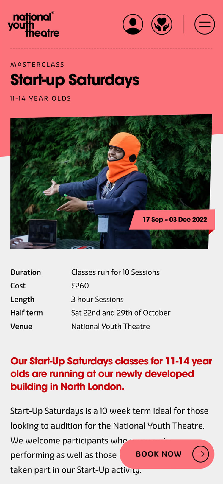
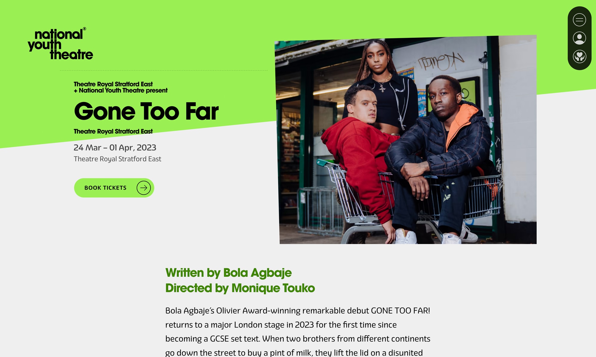
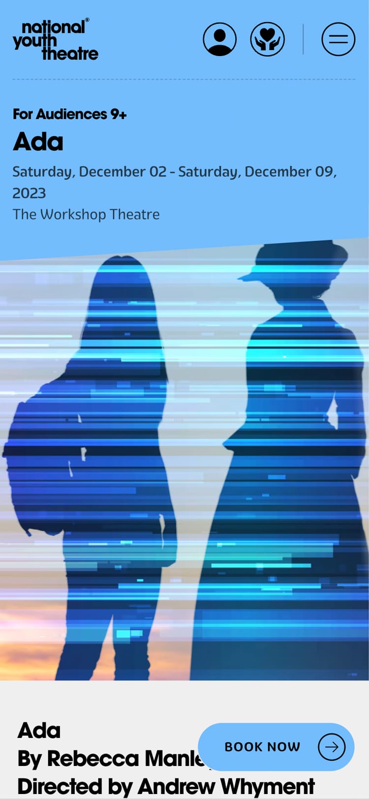
Visit SiteWe put our expertise to work in creating an accessible, mobile-first design to serve a young demographic. The work began with a full redesign that included visual branding and brand guidelines masterminded by our Head of Design. Taking inspiration from the angles of the organisation’s triangular logo and the kinetic energy of theatre, along with the architecture of the NYT’s newly redesigned main building, he created a fresh digital identity for the brand, bursting with energy and colour, while retaining readability and accessibility.
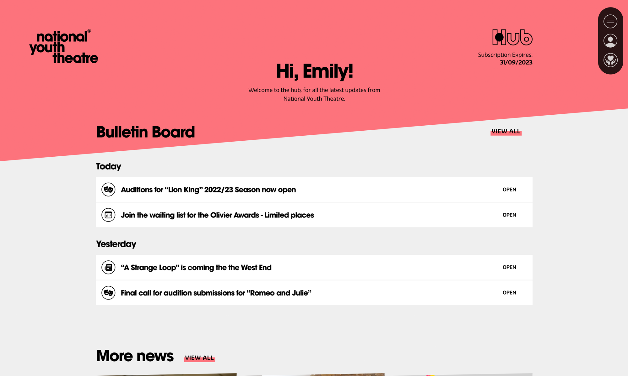
We helped the client source a new CRM provider, integrating GoodCRM to allow users to sign up for memberships, courses and make donations. Hidden behind the login, we created subscription-only members portals that would allow users to submit video auditions, access bulletins with opportunities and information, and manage their personal details.
As the site’s main users, young people were involved and included at every stage of the journey, from discovery and user research through to testing the finished product. Accessibility was a key consideration, and making sure users could apply to become members and sign up for courses with minimal parental aid was of utmost importance to continue attracting and admitting as wide a range of youth as possible.



Results
The end product is a site that reflects the National Youth Theatre’s users and members.
Since the site went live at the end of September 2023, early data shows that engagement on site has increased by 12%, and the time spent on site has increased by an average of 17%.
The number of users that visit more than one page has also increased by 9%.
