Melbourne Theatre Company
A new chapter for Melbourne’s home of theatre and live storytelling.
- Digital Brand Development
- CMS Development
- Digital Strategy
A long lasting working relationship
Founded in 1953, Melbourne Theatre Company is the longest running professional theatre company in Australia.
Having produced more than 750 stage productions in this time, Melbourne Theatre Company (MTC) has grown to become one of the most well-respected arts organisations in Australia.
-
We have had the privilege to work with MTC on various web design and development projects since 2012.
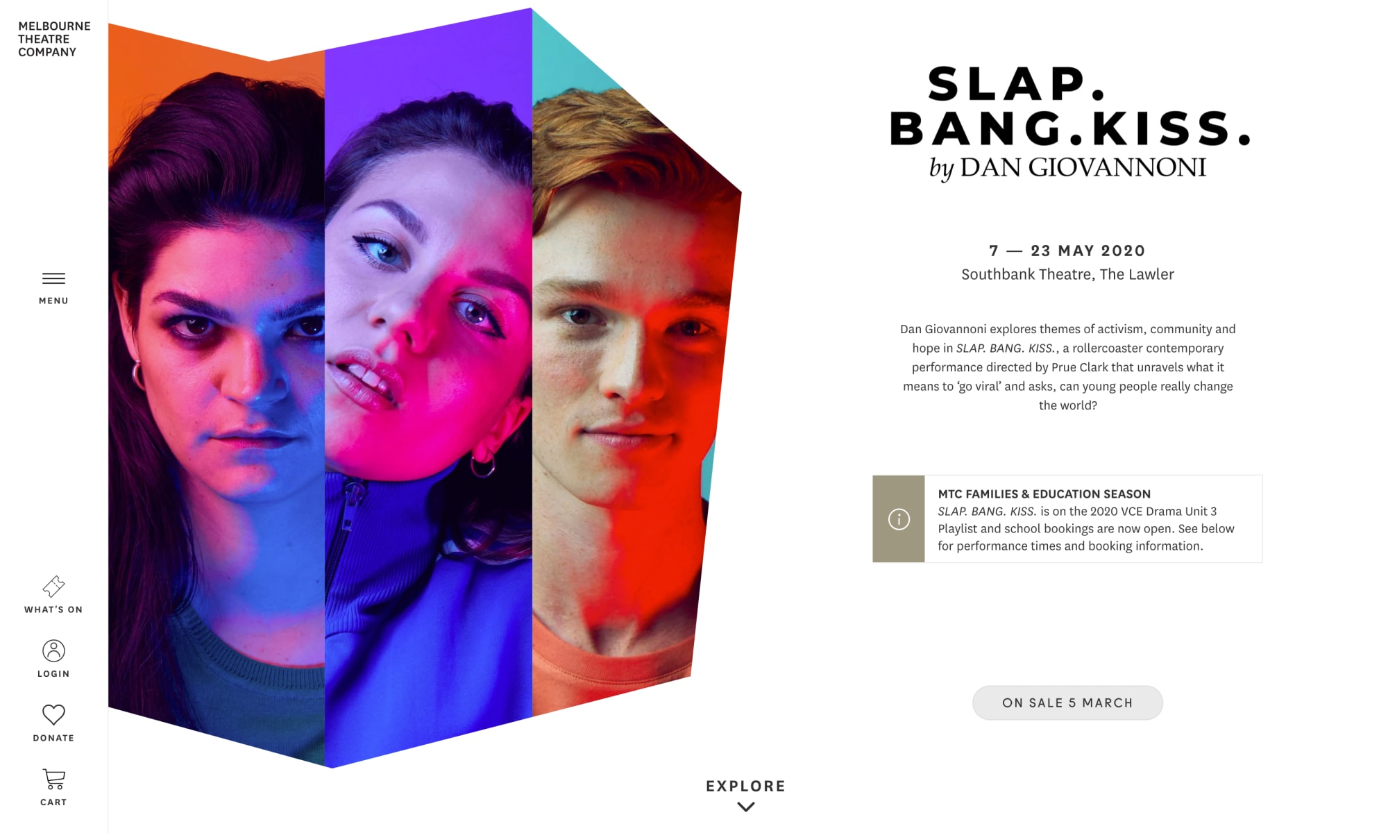
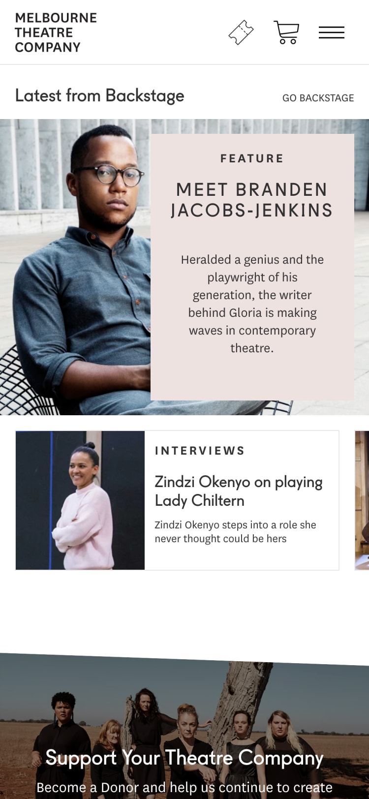
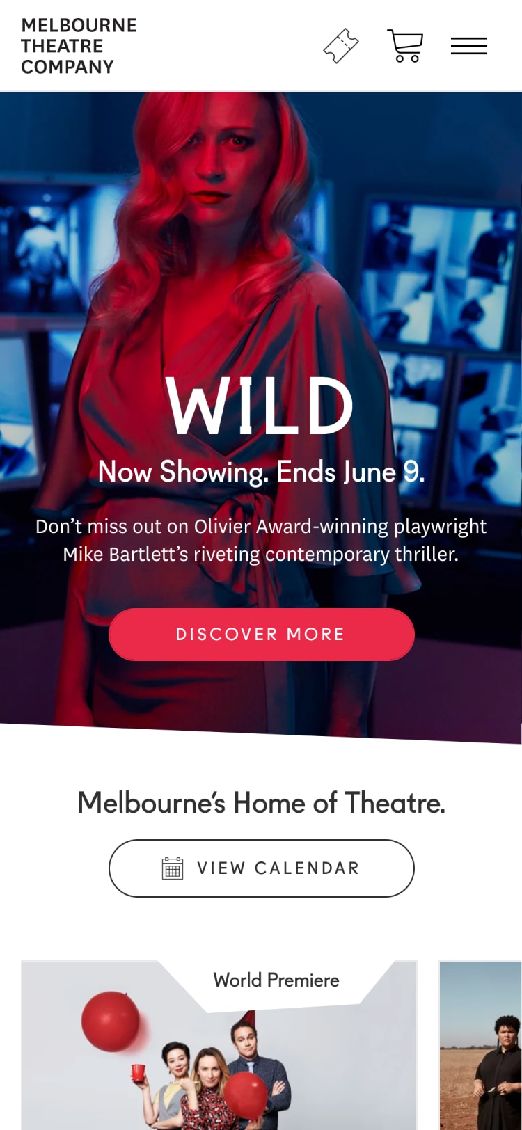
In 2017, MTC engaged Made Media in a project to redesign their website. MTC’s previous website had been live for five years and was starting to reach a point when it no longer represented the organisation’s brand, as well as feeling dated compared to the latest design trends and functionality.
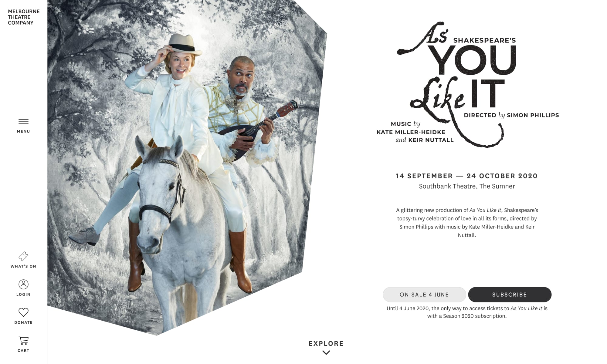
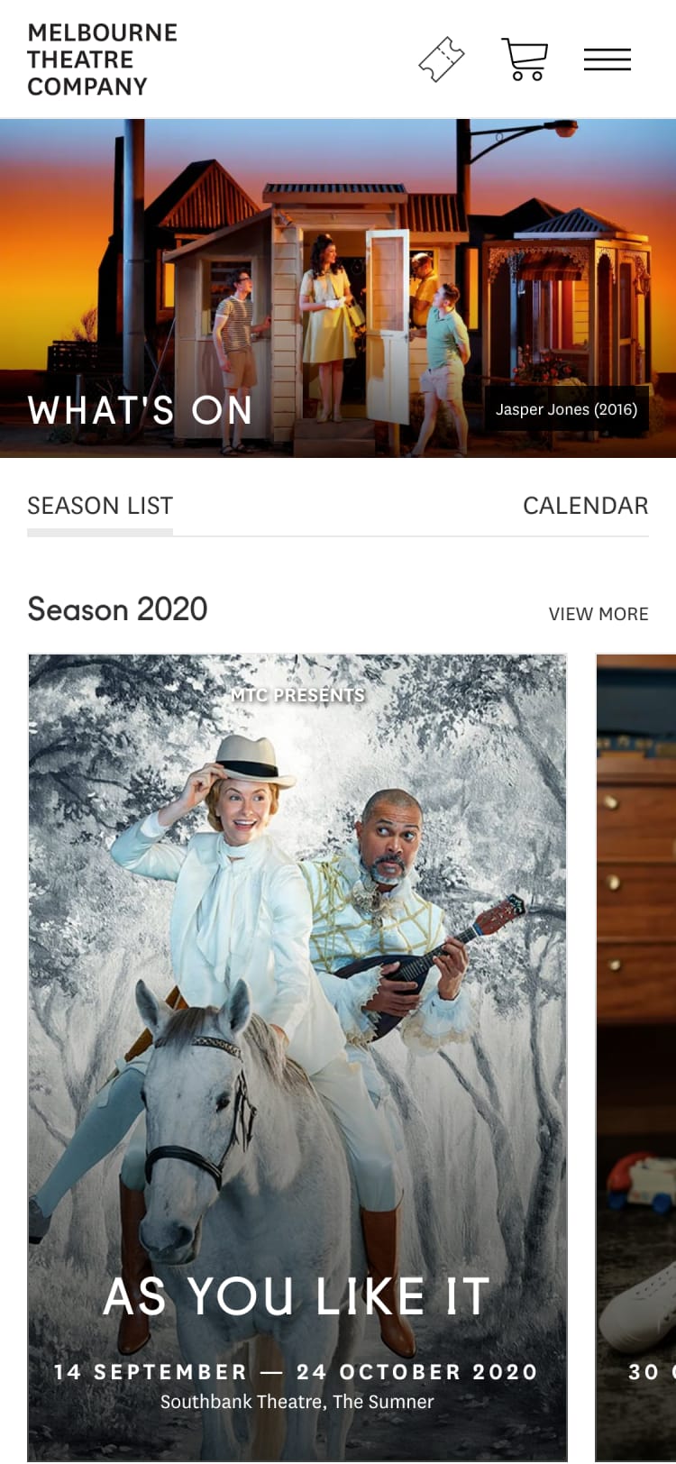
This project aimed to refresh the design and enhance existing functionality of the MTC website in order to create a seamless content-led website that provides a rich experience for audiences pre and post-purchase, with a look and feel that matches the organisation’s other marketing and communication output. MTC wanted the website to become a ‘one-stop-shop’ for tickets, production information, editorial content and any other MTC offering.
The website’s front-end functionality also lacked the content-marketing approach taken by the Company in an effort to focus on owned media. Understanding that the relationship between engagement, reach and attendance is cyclical, MTC wished to increase web visits and engagement, and, in turn, increase online transactions.
Having worked with Made Media over a number of years and projects, we knew they had the expertise and passion to deliver a website which would reflect our brand and values, while also helping to achieve our business goals.
Design refresh and functionality enhance
This project aimed to refresh the design and enhance existing functionality of the MTC website in order to create a seamless content-led website that provides a rich experience for audiences pre and post-purchase, with a look and feel that matches the organisation’s other marketing and communication output. MTC wanted the website to become a ‘one-stop-shop’ for tickets, production information, editorial content and any other MTC offering.
-
The website’s front-end functionality also lacked the content-marketing approach taken by the Company in an effort to focus on owned media.
Understanding that the relationship between engagement, reach and attendance is cyclical, MTC wished to increase web visits and engagement, and, in turn, increase online transactions.
In doing so, MTC wanted this project to address and improve on the following challenges:
Demographic Shift. Build features that would convert more of their browsing audience (25-34 years old) without alienating the buying audience (55-64 years old). To balance the needs of a younger audience who visit and browse more, and the older audience who buy more.
Strengthening Engagement. On the previous website, 51% of sessions only viewed one page. MTC work hard to create so much great editorial content and they saw this redesign as a key opportunity to improve the length and depth of visitor sessions.
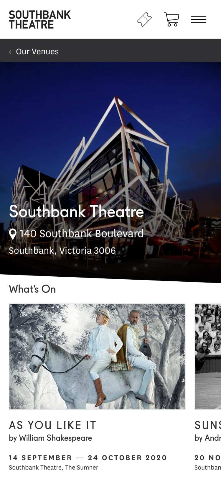
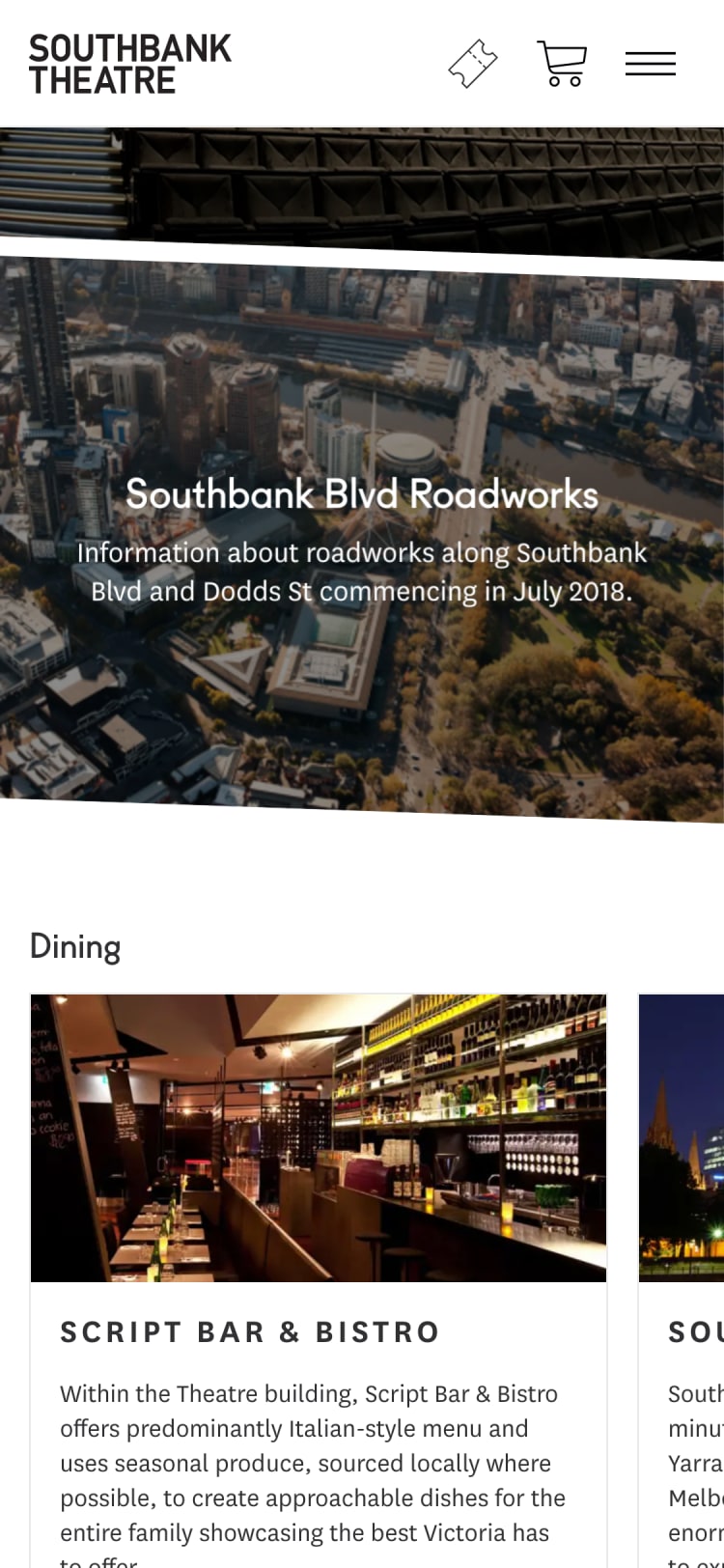
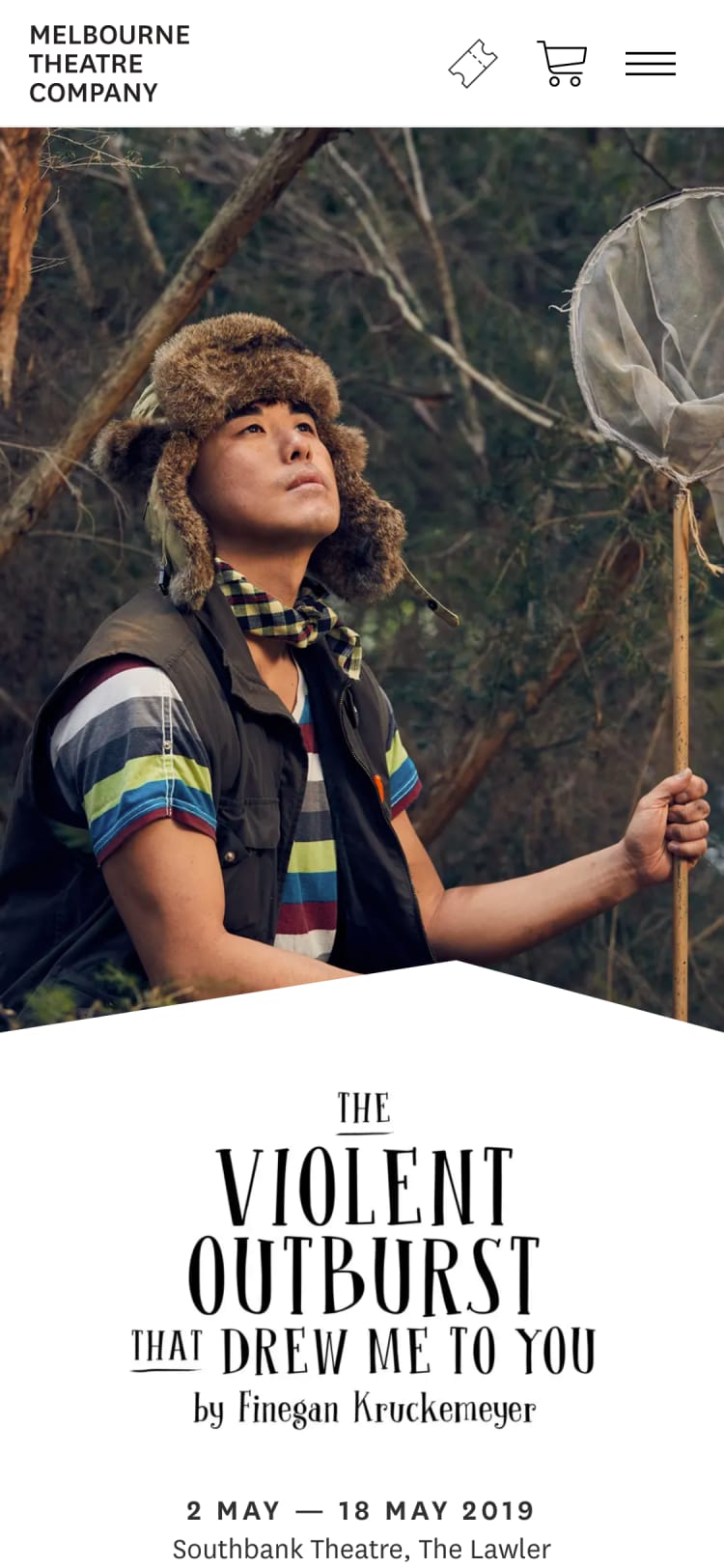
Mobile Visitation and Usability. Sessions from mobile devices only represented 38% of MTC’s total sessions at the time of the redesign and had a 52% bounce rate. MTC wanted to see these stats improve along with increasing transactions and revenue from mobile devices.
Increase Content Visitation. Previously, 50% of the traffic to the MTC blog came from email campaigns. This suggested that there was an issue around content discovery on the site. They saw an opportunity with the redesign to increase traffic to their blog articles from other high traffic pages within the site.
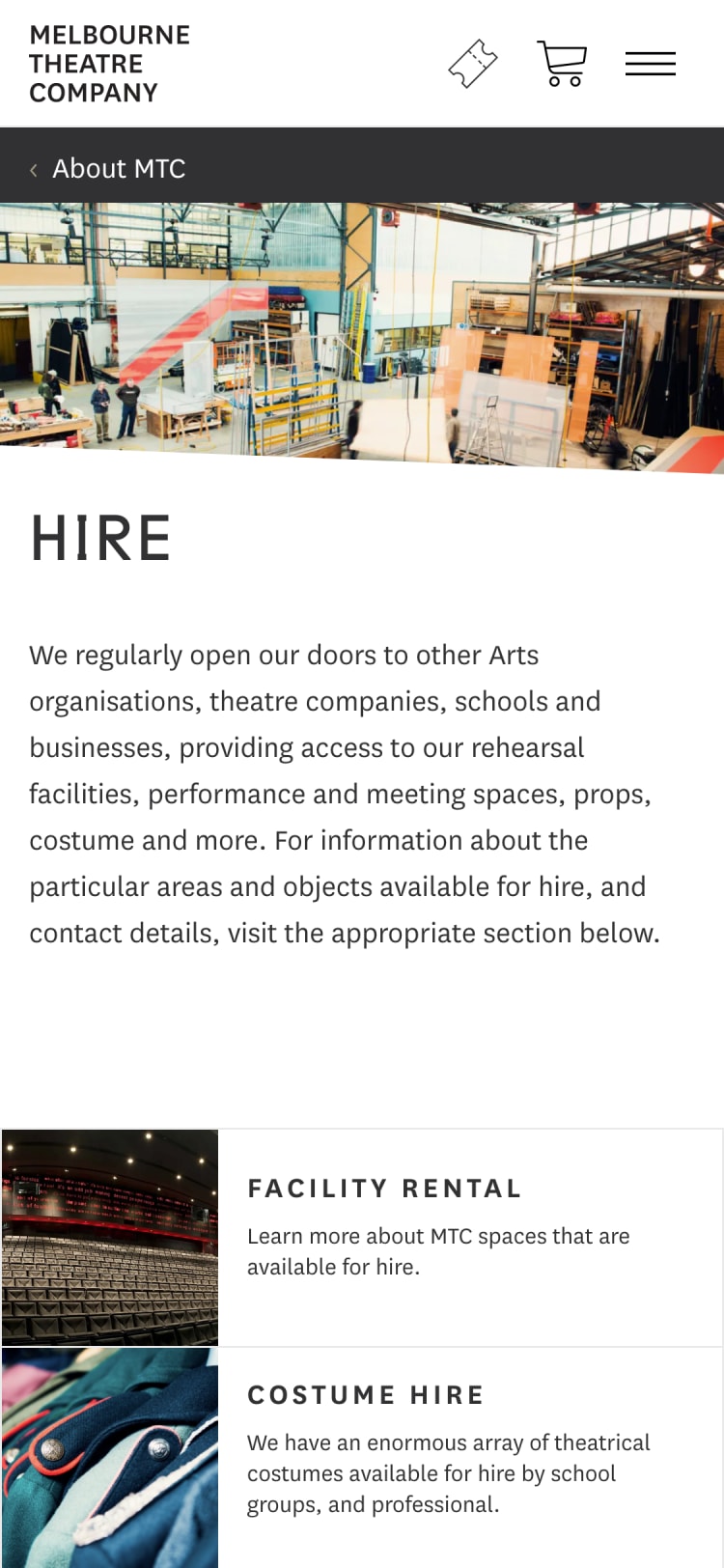
Flexibility. Responding to the audience’s online behaviour and content consumption was important to MTC, so it was imperative that the new website wasn’t locked into a strict template with a set hierarchy of information. Instead, each page is now made up of flexible content blocks that can be easily edited and rearranged to adapt the page’s content as required.
24% Increase in pageviews
11% Decrease in the bounce rate
24% Increase in pages per session
17% Increase in the average site duration
More engaged visitors
All of this indicates that visitors are more engaged with the content while also discovering more content resulting in spending more time on the website.
Those aged 55 - 64 spent 19% longer on the website and pages per session increased by 27% while the bounce rate also decreased by 19%. The conversion rate of those aged 25 & under increased by 12%.
Organic search visits increased by 4%, social visits increased by 56% & referral traffic increased by 69%. Visitors that discovered the blog from other key pages increased by 12%.
Made Media approached this project with enthusiasm and expertise as we knew they would. As an Australian company, having the opportunity to meet face-to-face with our Account Manager and designer during key moments in the process was vital to the project's success. This resulted in a deeper understanding on both sides of the goals and desired outcomes, and enabled us to work as one team throughout, sharing ideas and innovations along the way.
What we did.
- Strategic definition
- Digital rebrand
- User experience concept
- Product renders
- Icon library
- CMS development