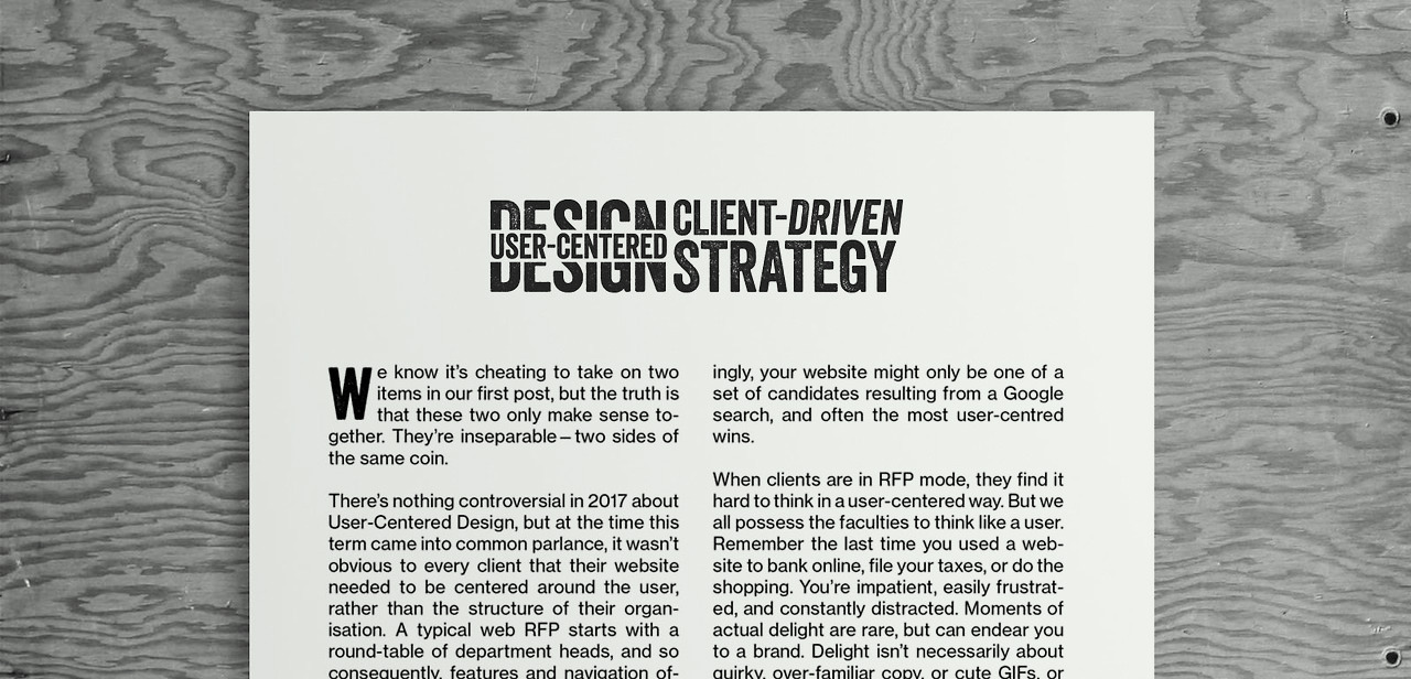
We know it’s cheating to take on two items in our first post, but the truth is that these two only make sense together.
They’re inseparable—two sides of the same coin.
There’s nothing controversial in 2017 about User-Centered Design, but at the time this term came into common parlance, it wasn’t obvious to every client that their website needed to be centered around the user, rather than the structure of their organisation. A typical web RFP starts with a round-table of department heads, and so consequently, features and navigation often wind up being department centric. Of course the user has no mental map of your organisation’s departmental structure, and so often websites do not center around the user.
It only takes sitting in on one or two usability tests to learn that people approach your website with needs and expectations completely at odds with the way your organisation conceives of itself. More disconcertingly, your website might only be one of a set of candidates resulting from a Google search, and often the most user-centred wins.
When clients are in RFP mode, they find it hard to think in a user-centered way. But we all possess the faculties to think like a user. Remember the last time you used a website to bank online, file your taxes, or do the shopping. You’re impatient, easily frustrated, and constantly distracted. Moments of actual delight are rare, but can endear you to a brand. Delight isn’t necessarily about quirky, over-familiar copy, or cute GIFs, or millennial pink. Actual delight is about having something work the way you expect and preempt your problems. We find this is so unusual that it goes a long way to earning brand loyalty.
At Made we like to refer to ourselves as a design agency that works in the medium of code. Some of us have been reading the latest thoughts on usability since 2002, so at this point thinking like a user comes relatively easily to us. Which is not to say keeping users happy is easy. But the truth is that, from the point of view of a design agency, even the best user experience is meaningless without due consideration of Client-Driven Strategy.
The problem with this excellent User-Centered Design is that it exists completely devoid of Client-Driven Strategy.
If you wanted to deliver the best User-Centered Design for a performing arts center, it might be quite easy to envisage. You dictate your ticket request into a digital assistant that knows you and understands your preferences. You get the best seats to the most popular show, free of charge. A complimentary chauffeur-driven limousine is dispatched to ferry you to the venue, where an attendant presents you with your favourite drink before the curtain rises. The problem with this excellent User-Centered Design is that it exists completely devoid of Client-Driven Strategy. The client strategy might involve selling more artistically challenging work to users who don’t know they want it yet, at a margin that will be sufficient to contribute to the organisation’s own development. The budget might not yet allow for AI bots.
So the actual job of a designer is to find the sweet spot that gives the user the best possible experience whilst meeting the client’s strategy, given constraints around budget and timescale. It’s a reason that UX can’t exist as a meaningful role if it’s delivered without reference to technology, budget, and strategy. They’re inseparable.
Let’s take an example: Interrupting a user’s digital journey with a roadblock popup to ask them to consider making a gift above and beyond the face value of their tickets. In some respects, this is the opposite of User-Centered Design. The user didn’t visit the site with the objective of giving, they just wanted to get their seats. Burying those messages and asks in a section called Support Us, which the client can pick if they’re interested, is effective User-Centered Design, but it’s terrible client strategy.
So the ideal design solution interrupts the user, yes, but frames the ask in a way that is consistent with the brand, minimises irritation, maybe even actually makes the user feel good about giving. Most importantly it supports the client’s strategy. Good design is about finding the sweet spot where both user and client win.

